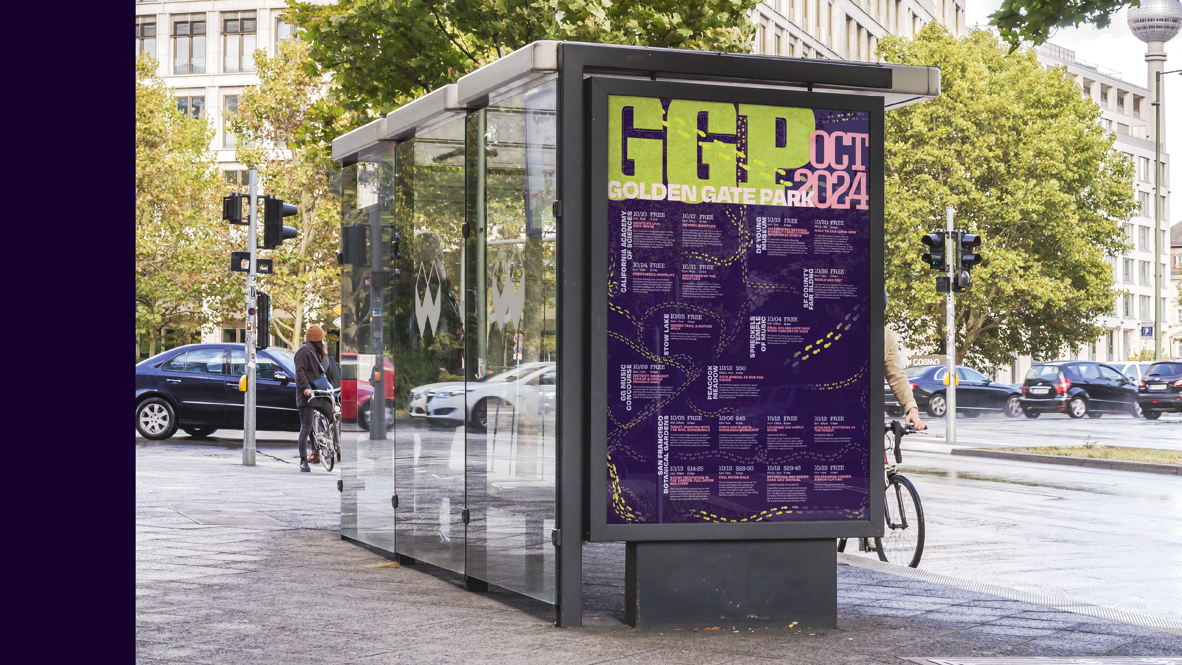
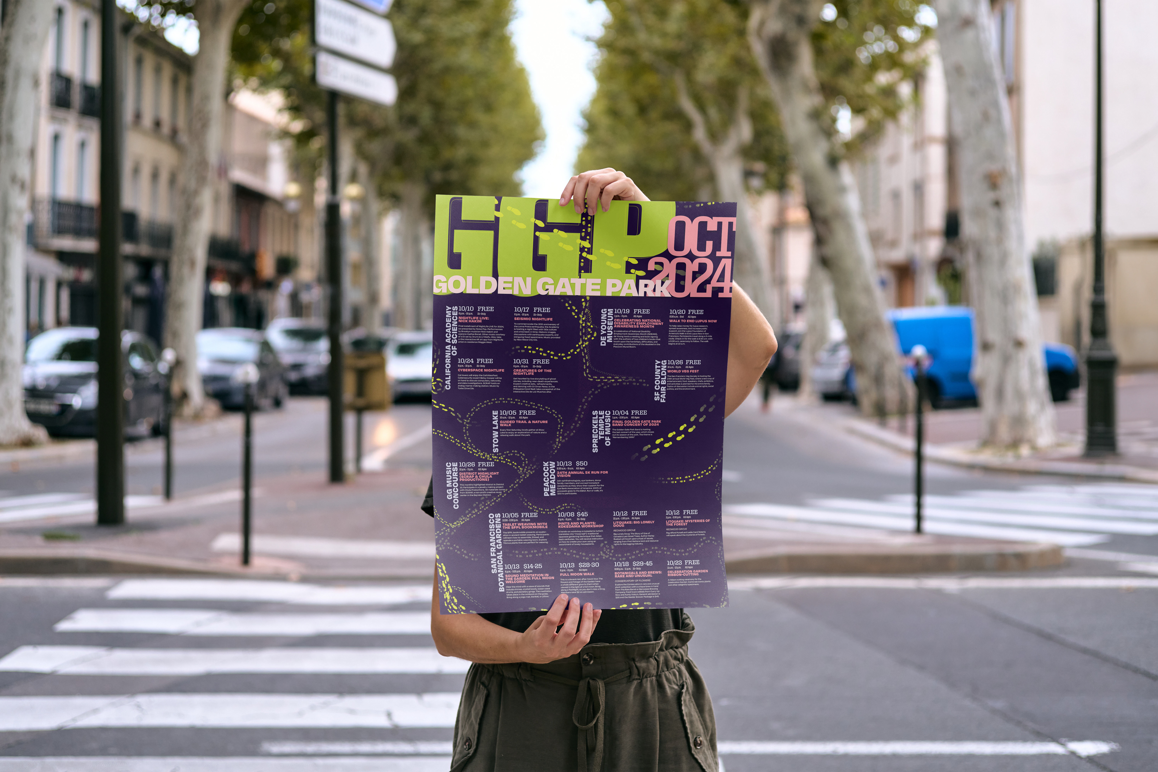
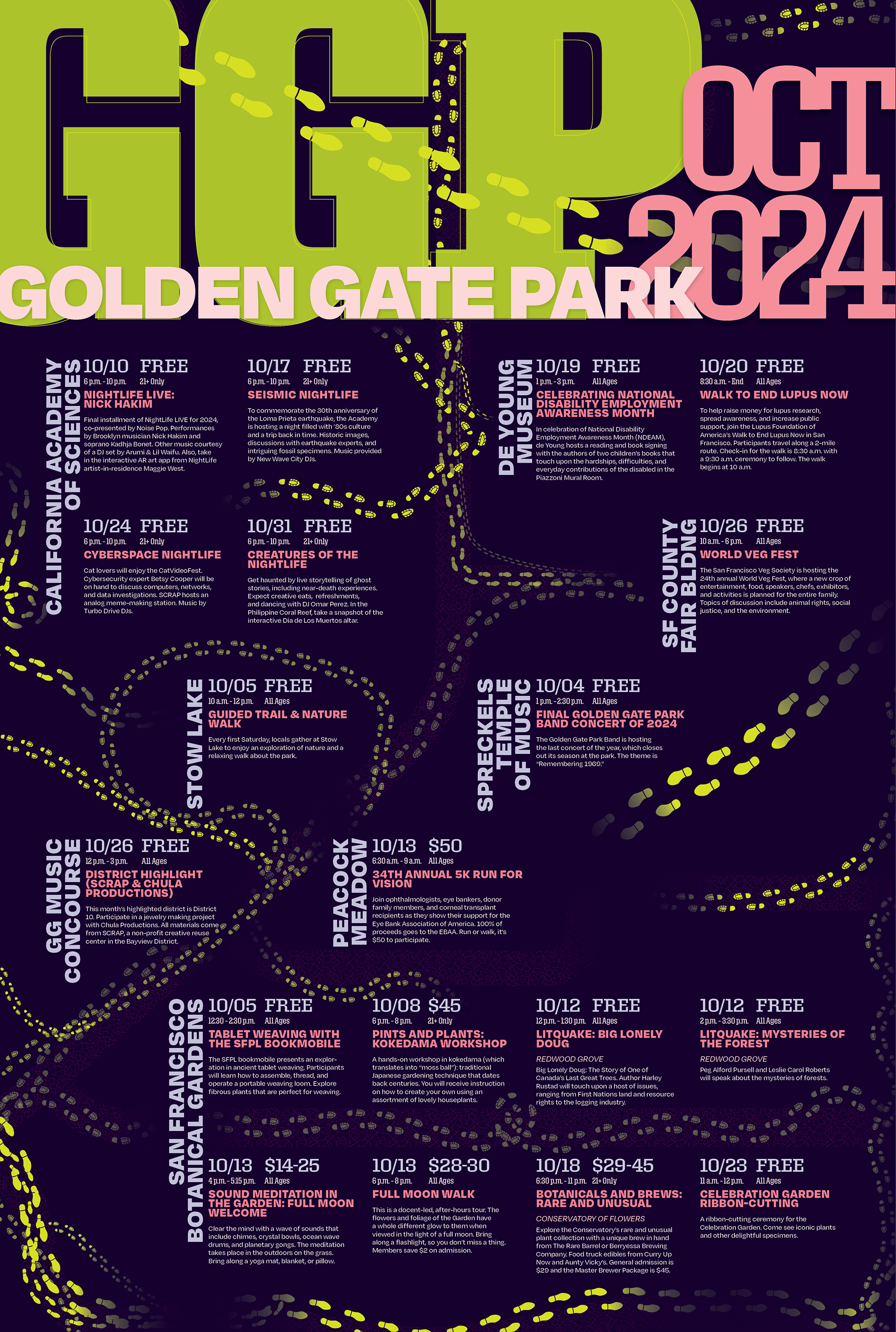
Golden Gate Park
Event Poster
Role
Visual Designer, Typography, Concept Development
Challenge
Create a vibrant, engaging poster series that effectively communicates the diverse nature of events at Golden Gate Park while visually unifying them under a consistent identity.
Goal
Design an approachable, visually captivating series of posters to increase public interest, attendance, and awareness of community events hosted by Golden Gate Park.
Clarifying the Marginalia
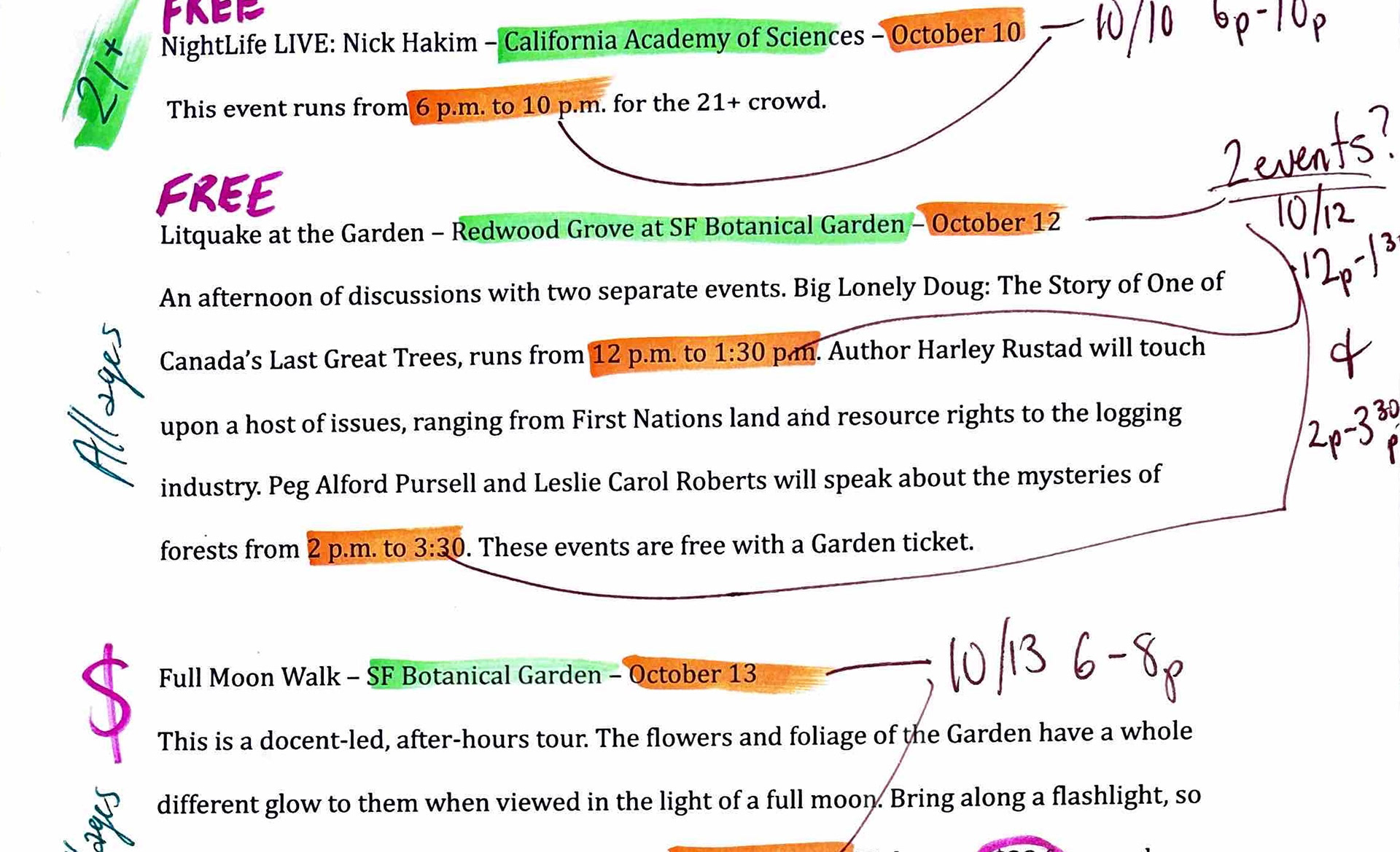
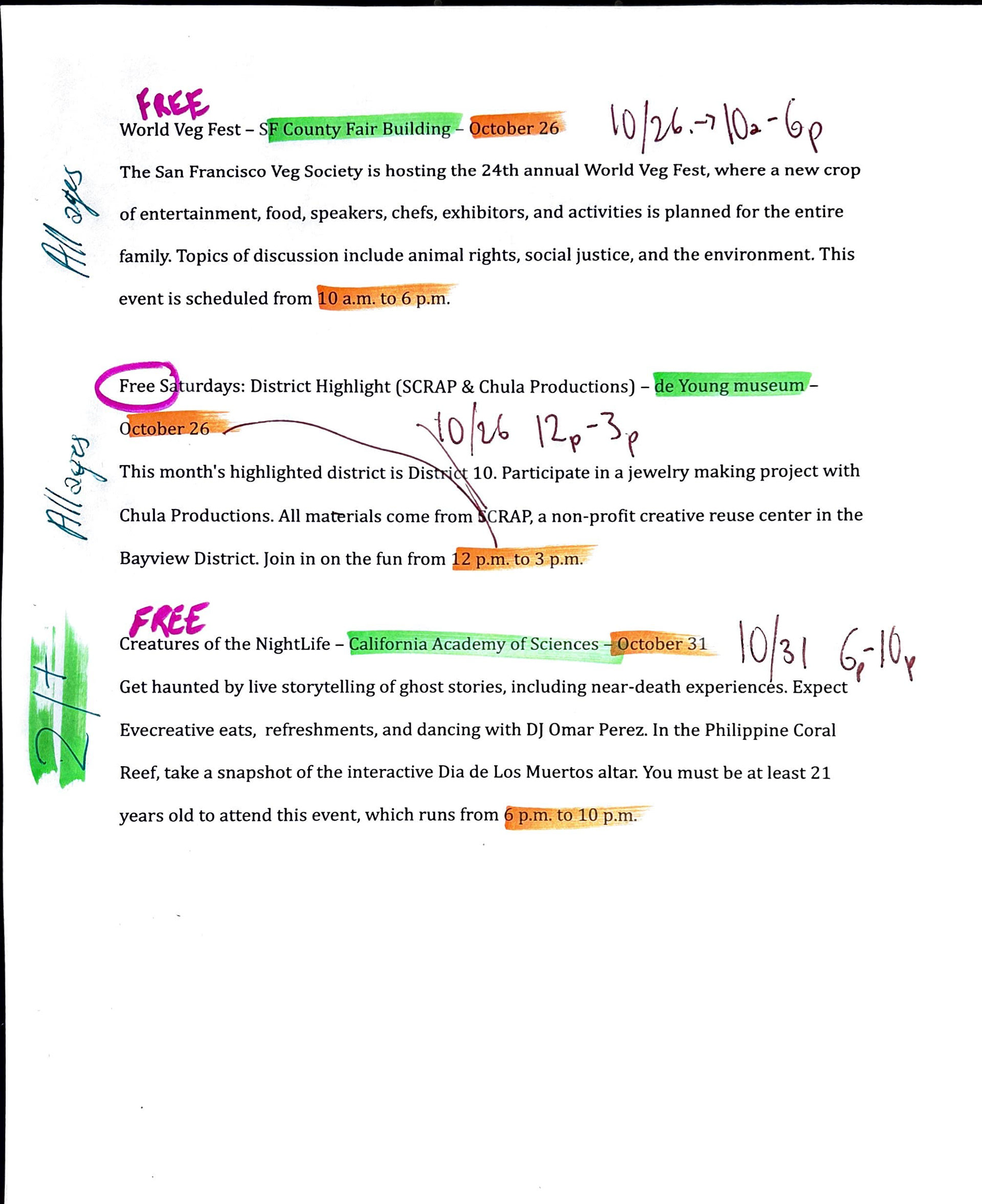
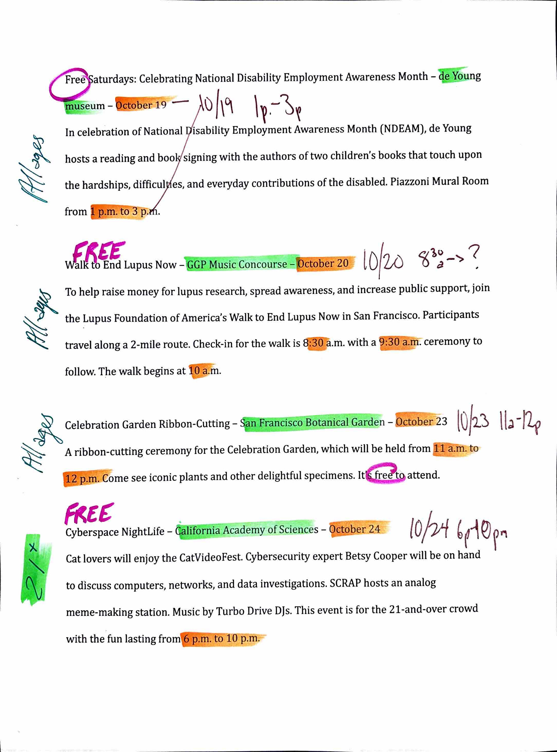
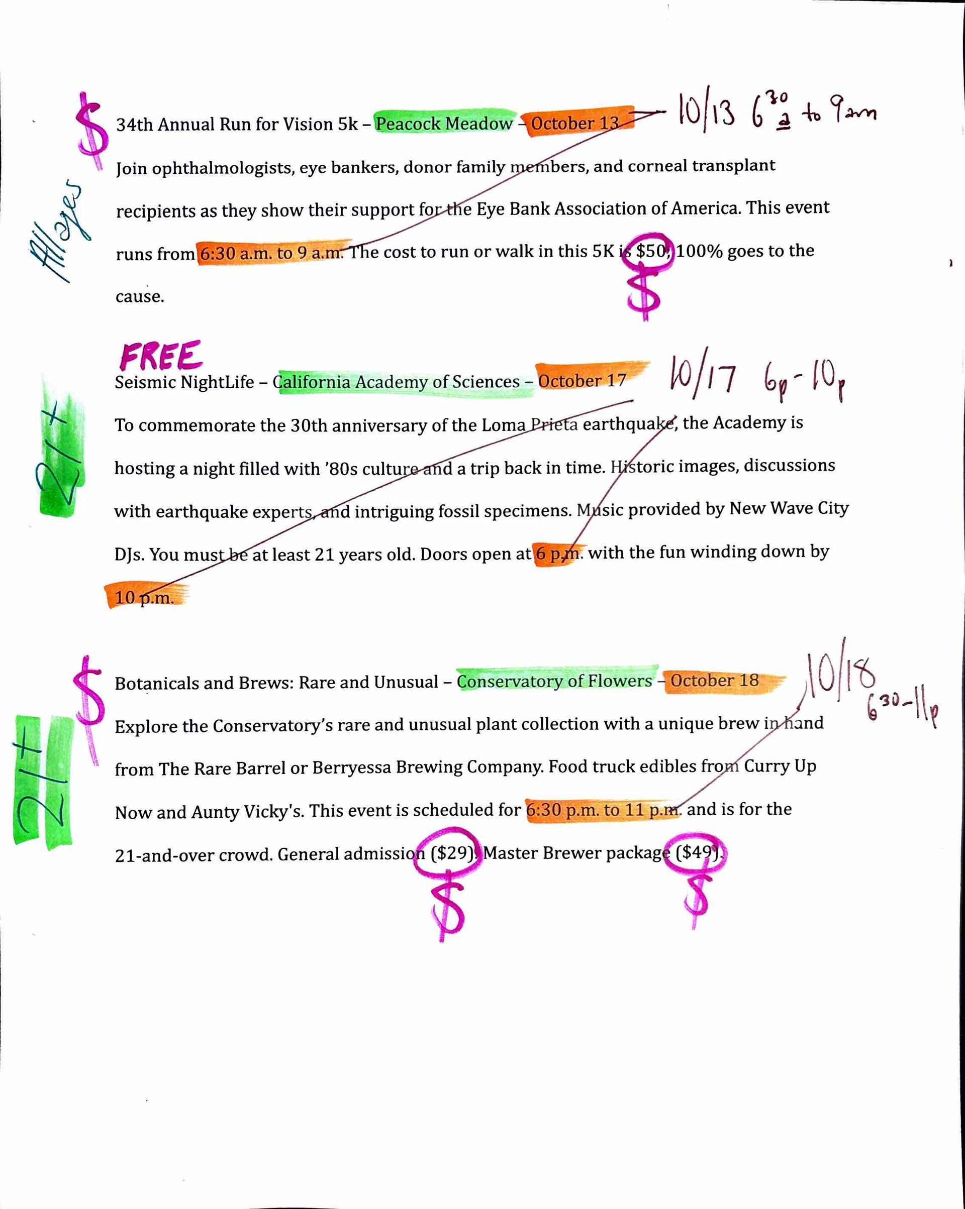
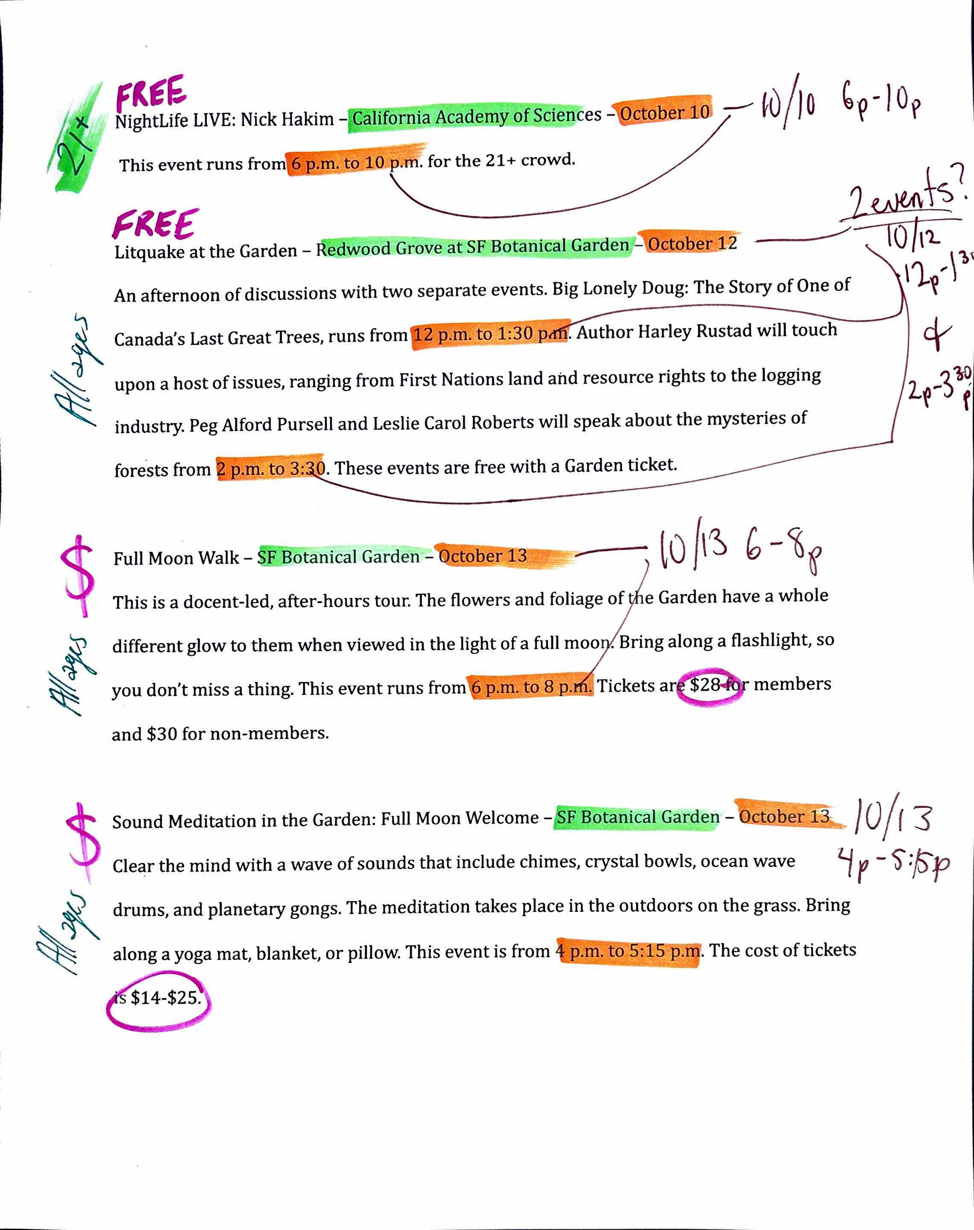
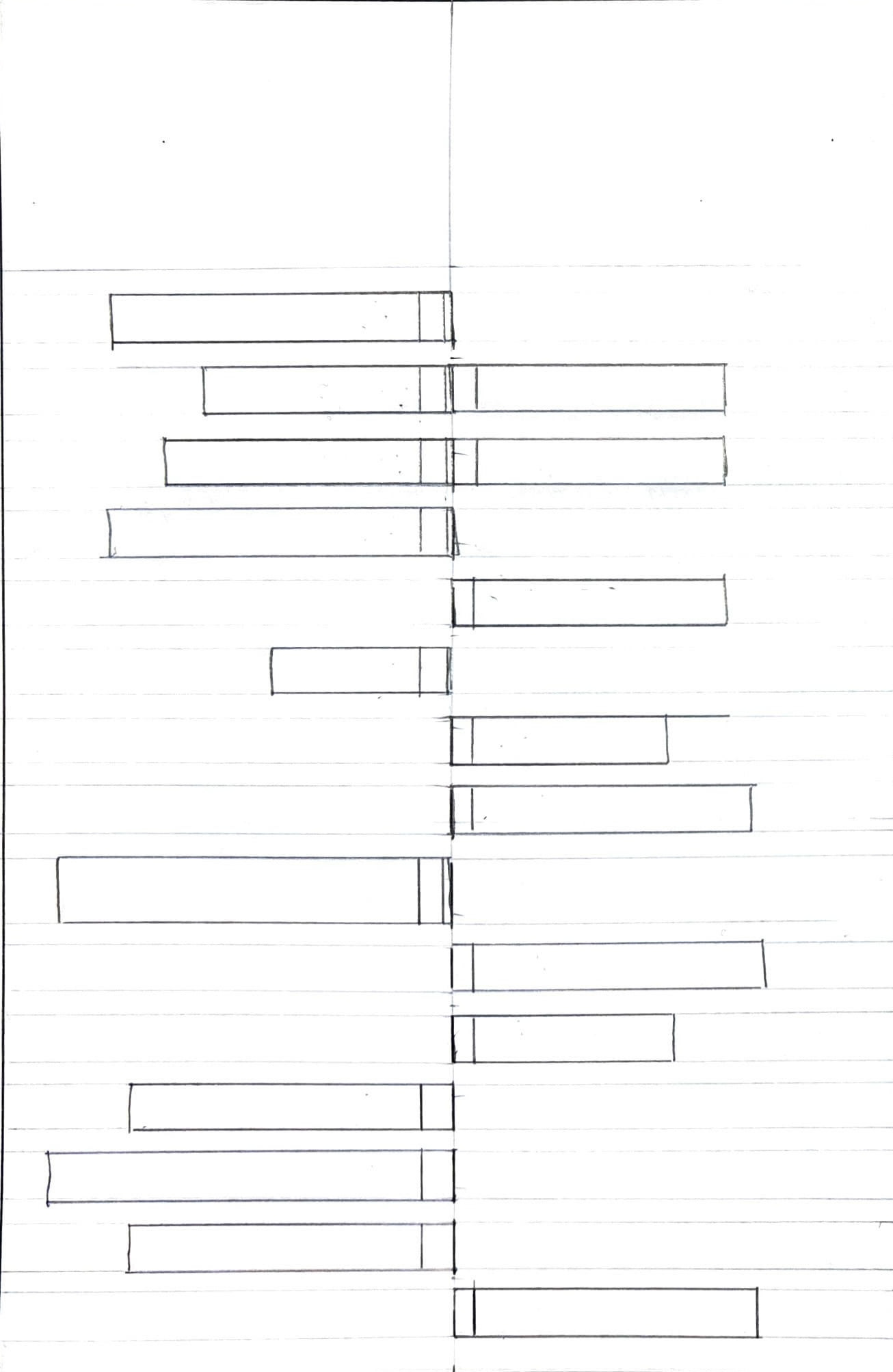
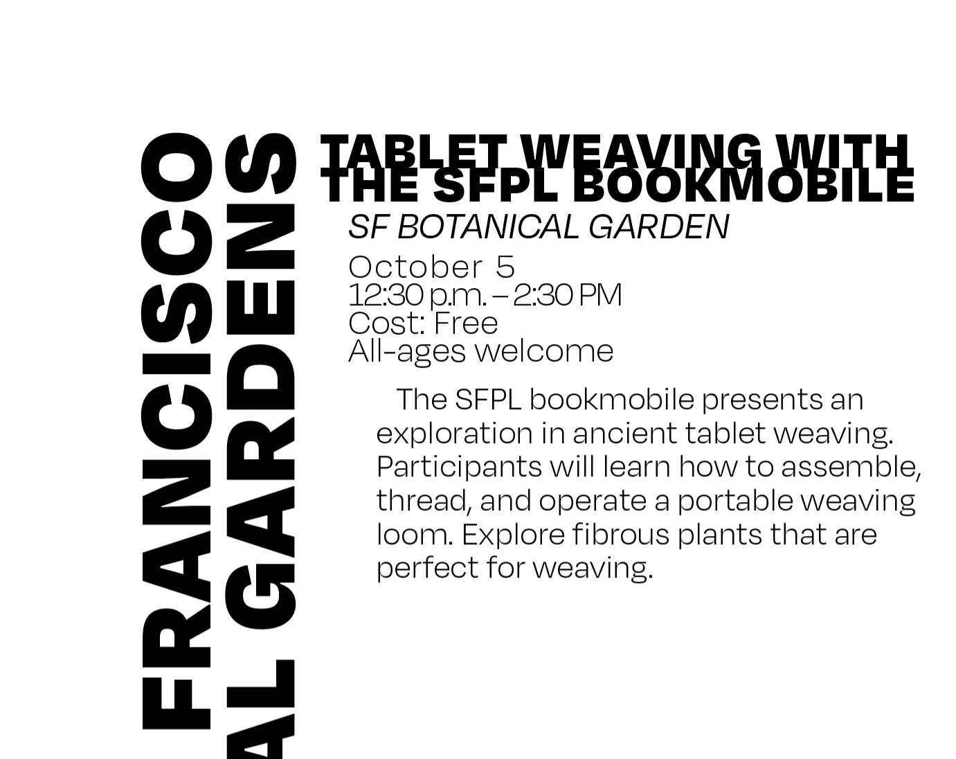
Revising the provided copy text was crucial to the success of this project. I transformed dense and inconsistent event information into a clear, unified language system. By categorizing events according to their locations within Golden Gate Park, the design established intuitive visual hierarchies.

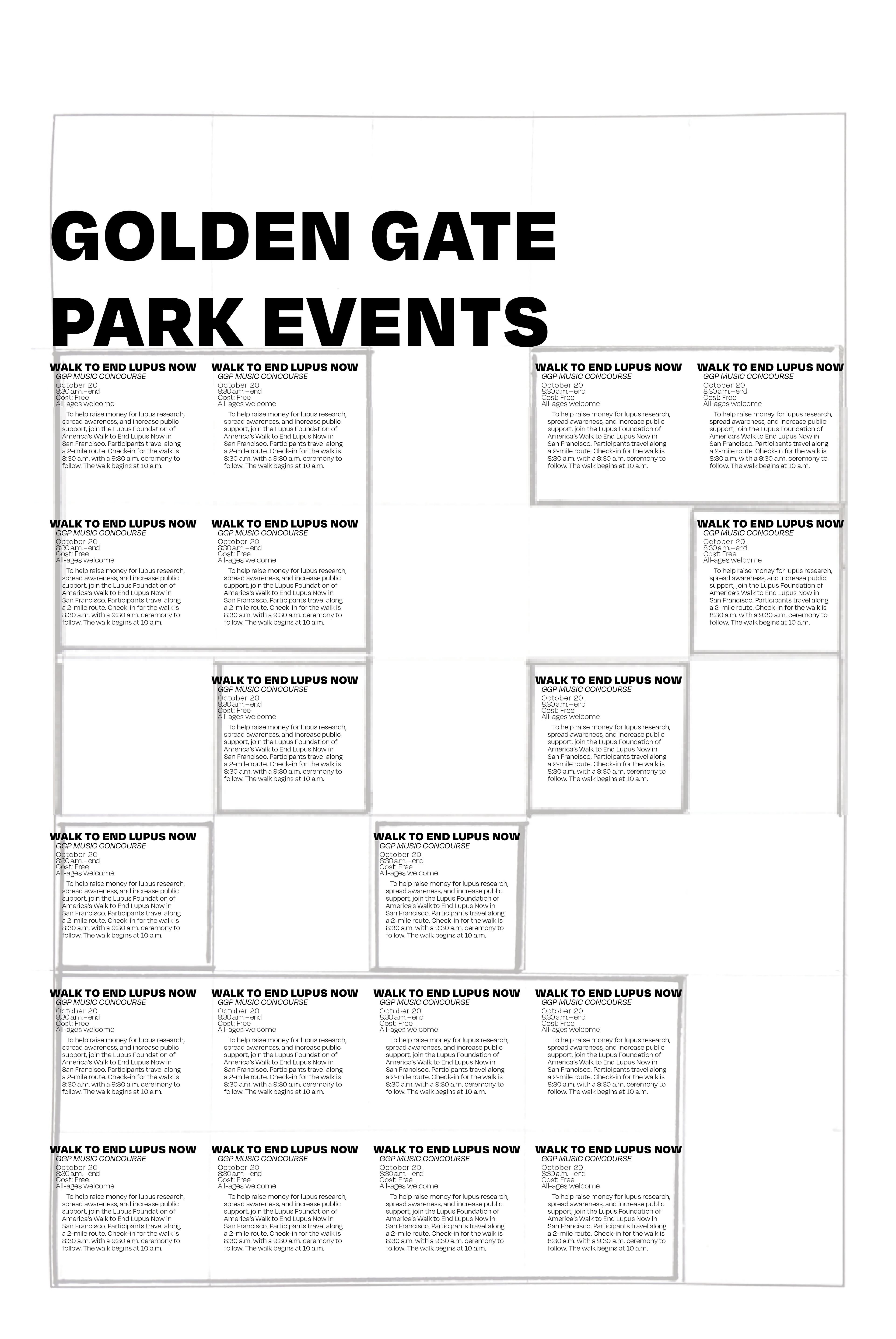
Organizing information in different ways
With so much information to display, it was crucial to find an effective way to show all of the different events: by location, time, cost, date, etc.
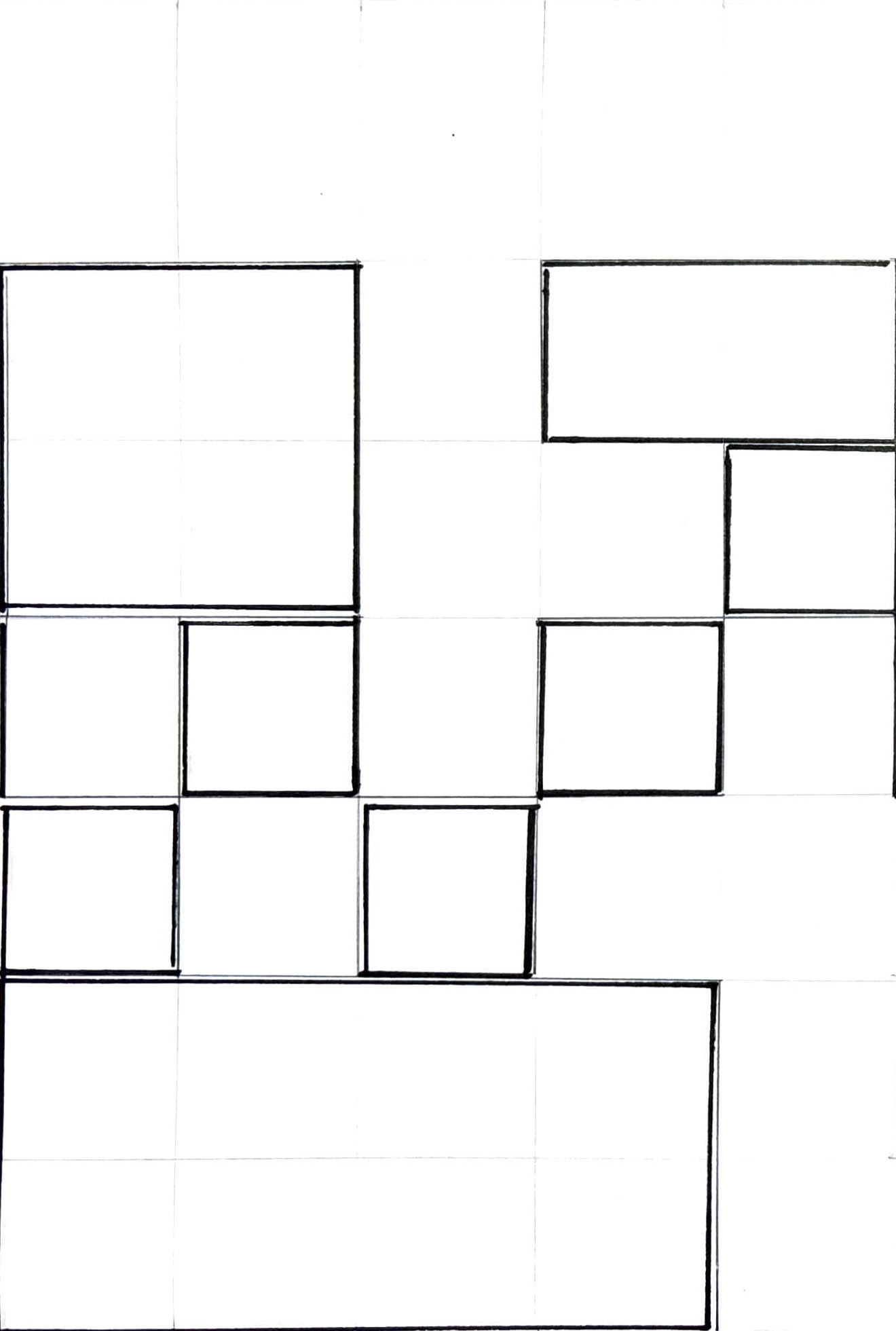
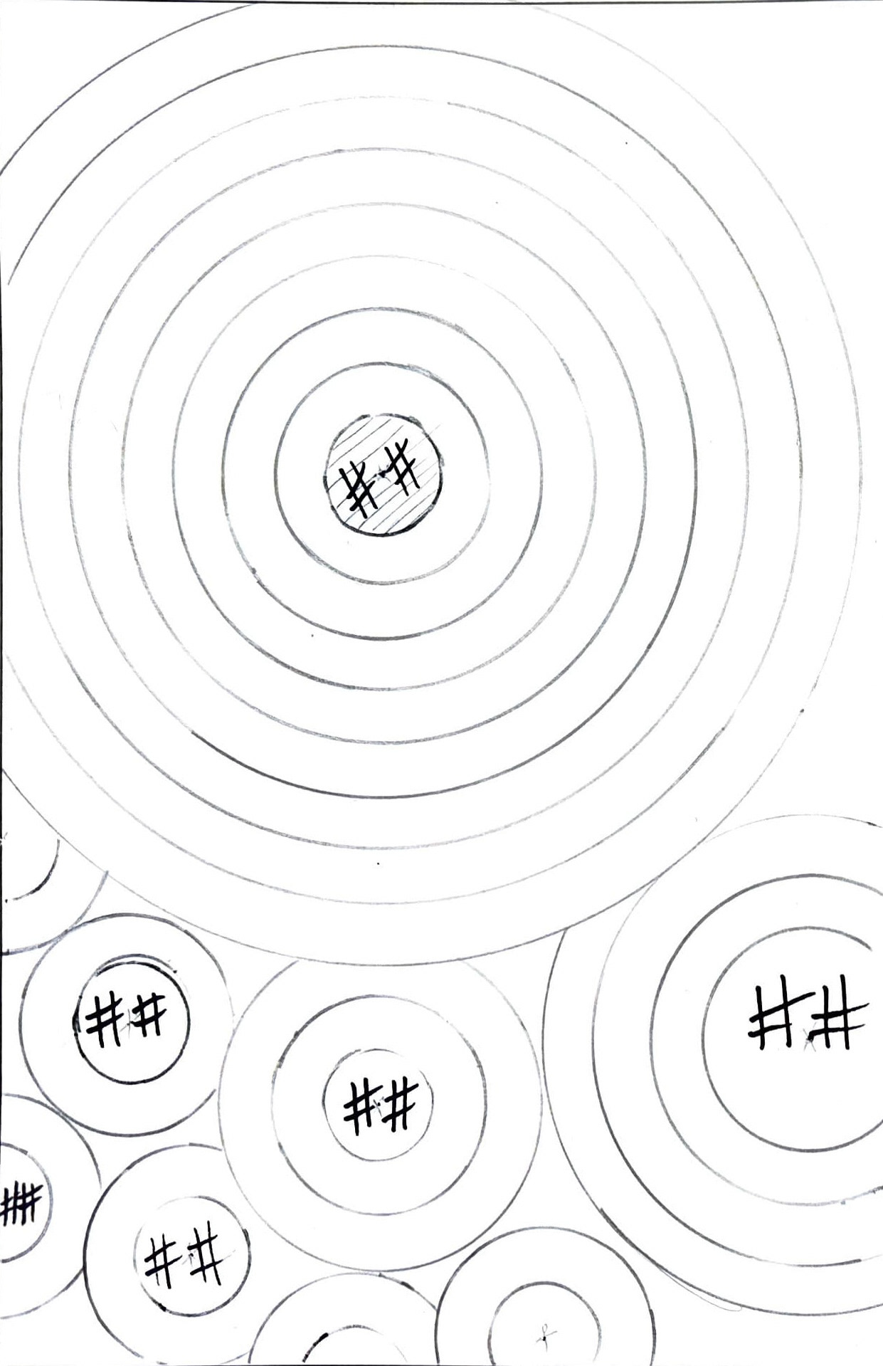
Building on the sketches: Grid by Location
Drawing directly from their initial sketches, we set the event information based on the event location, while allowing proximity and grouping effects to drive the hierarchy of the information position
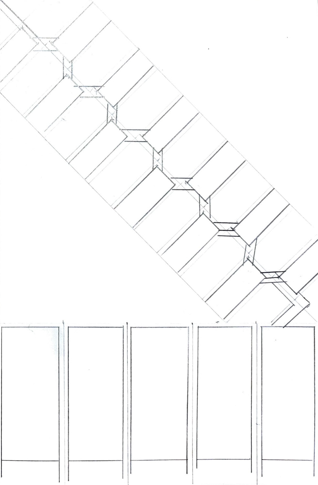
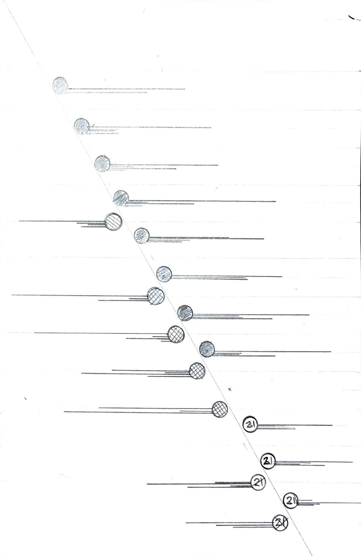
Exploring graphic elements & color choices
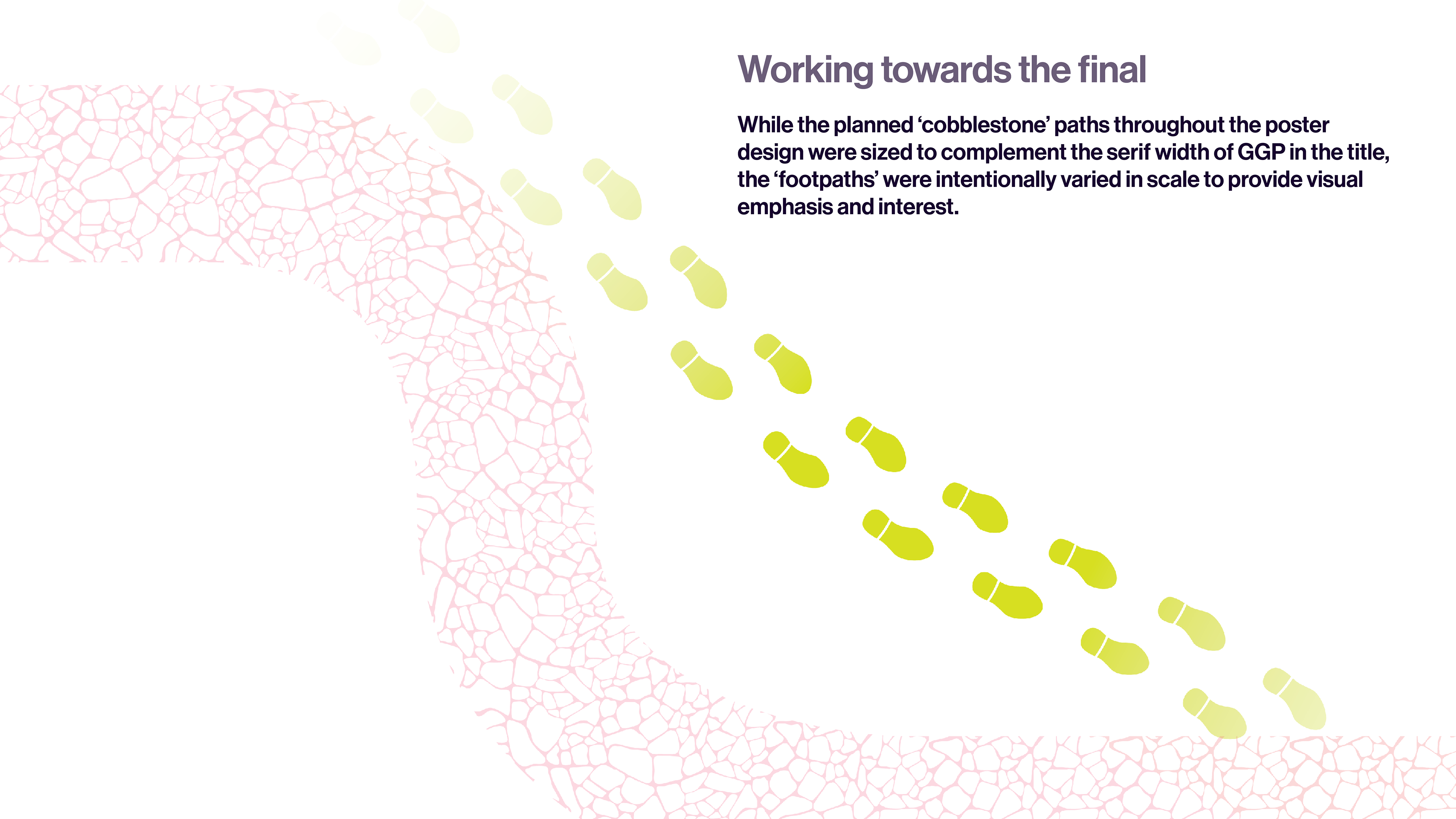
The work explored various visual themes, including houses, autumn leaves, and Jack-o’-lanterns, later shifting focus to park paths and experimenting with type design through counters, strokes, and repetition. A rich nighttime and music-inspired color palette was incorporated to create balance, rhythm, and visual interest.
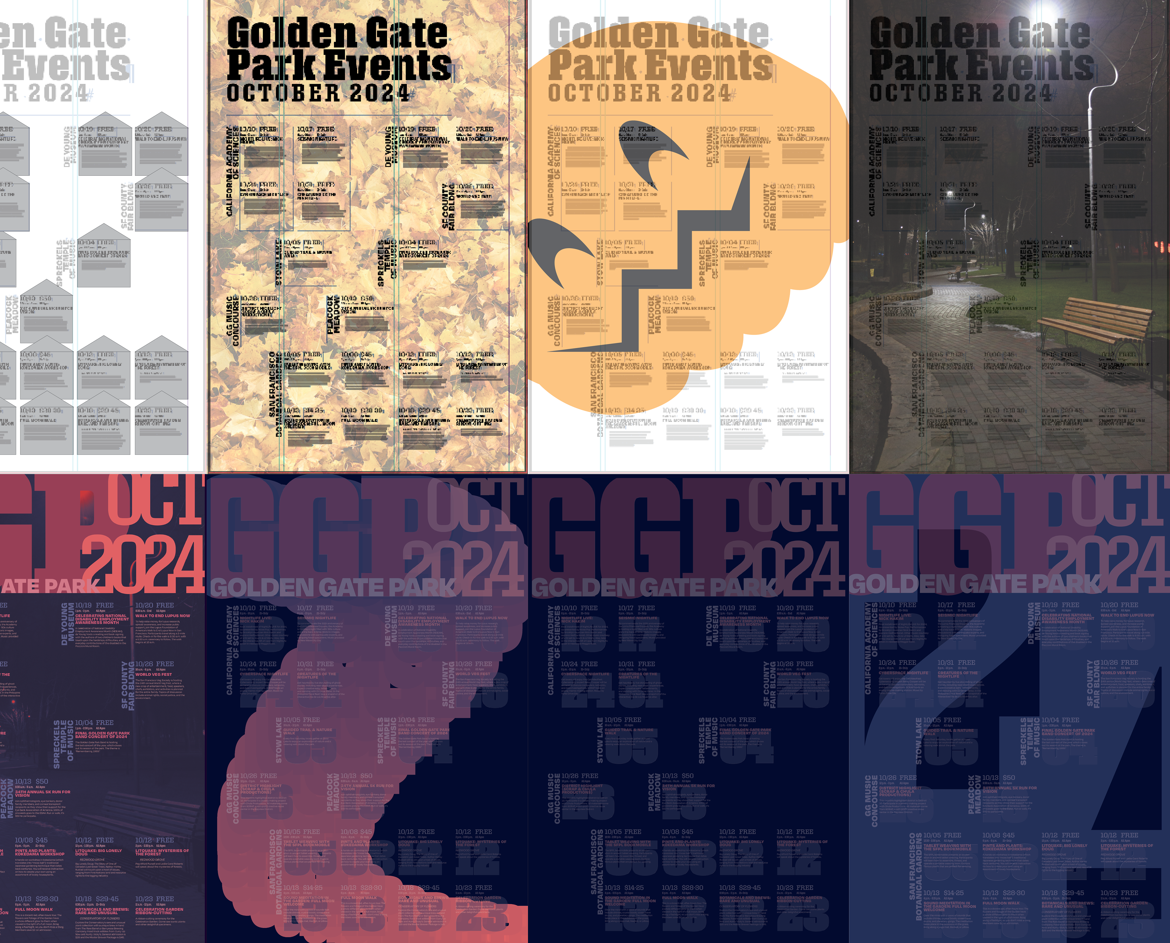
At this point, I was feeling lost, and way off-course...
I had to go for a walk.
Why not take a stroll through Golden Gate Park?
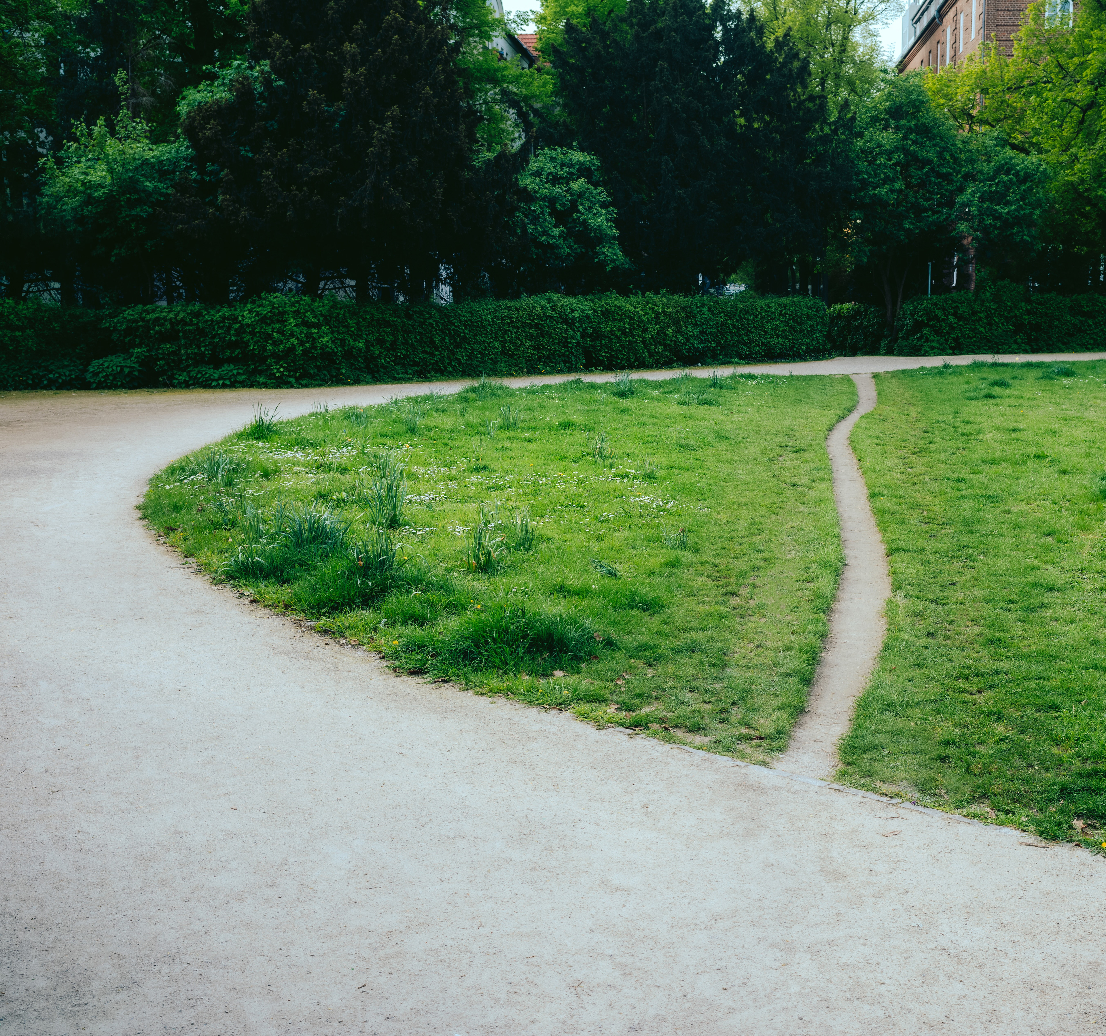
Many paved paths were often bypassed in favor of more efficient or direct footpaths.
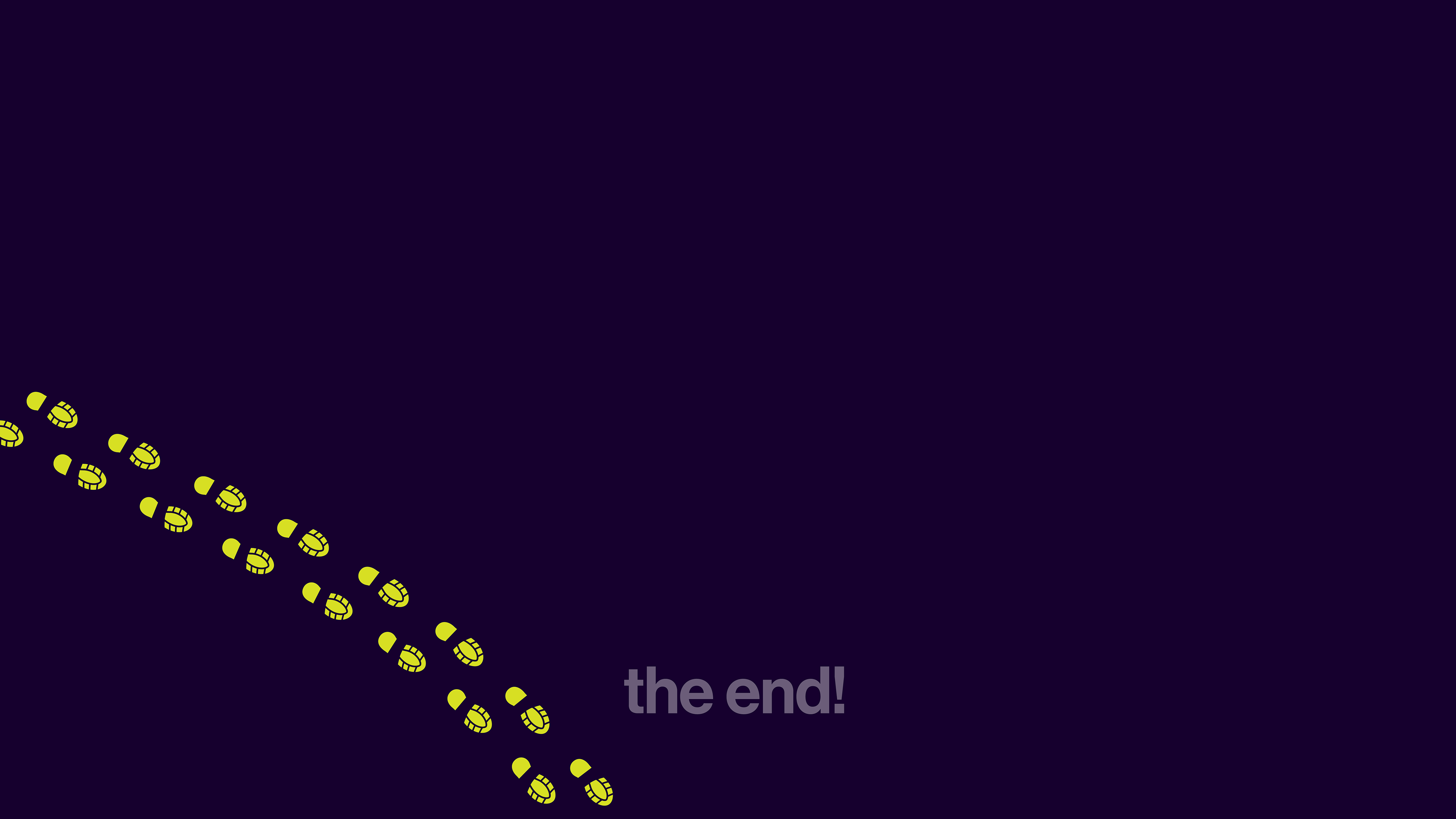
There is a Dutch city planning concept called olifantenpaadjes which translates to ‘elephant paths.’ Also called ‘desire paths,’ they fly in the face of the designed paths while frequently becoming adopted by the population because they are just better.
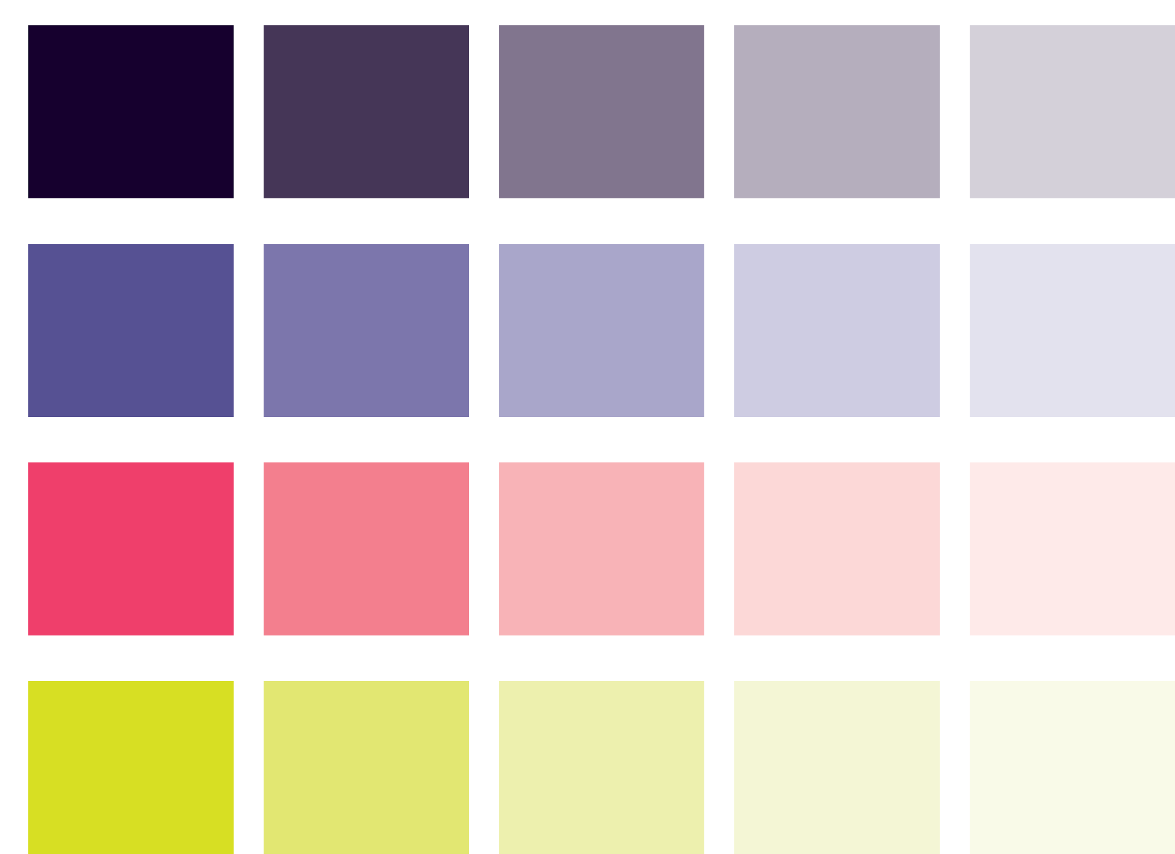
Analogous Purple-Magenta
Logical, structured, organized, and aligned event information
Glow-in-the-dark Green
Non-linear desire paths reject structure and organization
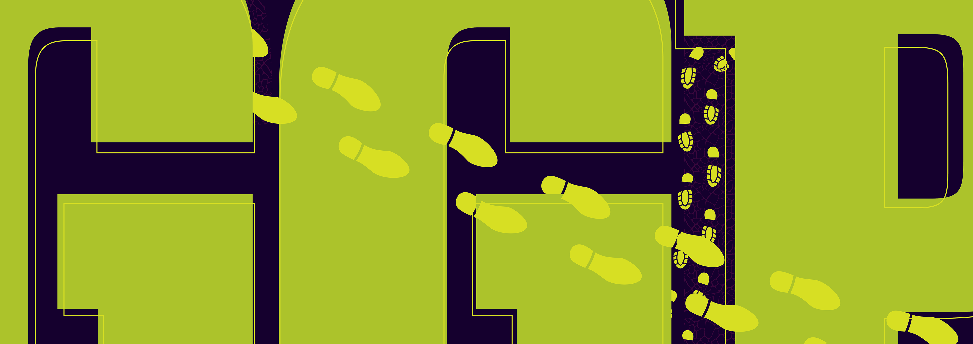
Bolder for Balance
Title color was changed
Scale was also key to making an imapct
Reflections on Future Versions
Further experimentation
While the final outcome was successful and well-received, I believe there is still room for improve the design
Unique Landmarks
Graphic elements unique to the park (e.g. outlines of Stow Lake, Spreck Temple of Music, etc.)
Seasonal Changes
Future variations might be better suited to spring and summer, as well as highlighting daytime events